You resize a photo for a website, and the upload still fails. Or you crop an image and someone asks, "but what's its actual resolution?" The word "size" is doing a lot of work here — and picking the wrong measurement is usually why these moments happen.
Image size can mean pixel dimensions, storage weight, aspect ratio, print dimensions, or the size an image occupies on a web page. This guide separates those measurements, explains when each one matters, and shows how to check them without turning a simple question into a guessing game.
How to Check Image Size Online
The fastest route is a browser-based checker that reads the file locally. You do not need an account or an editor just to answer a factual question about a file.
Five quick steps
- Open the Image Size Checker.
- Choose an image, drop it onto the page, or paste an image from your clipboard.
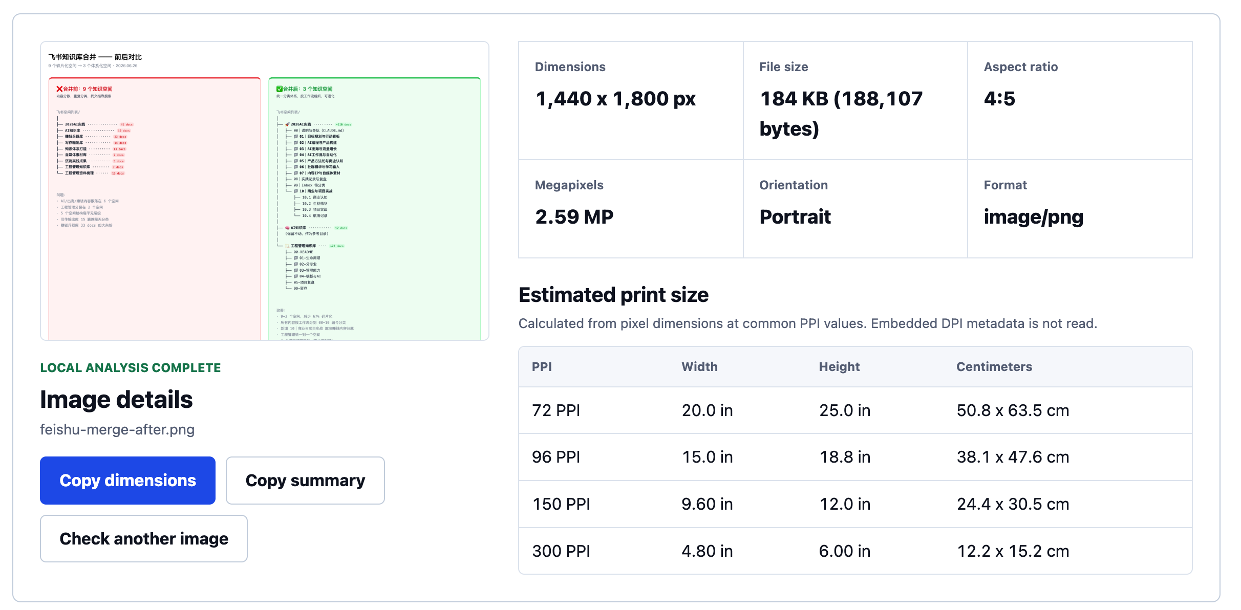
- Read the pixel width and height, file size, format, aspect ratio, and megapixels in one result.
- Compare estimated print dimensions at 72, 96, 150, and 300 PPI when physical output matters.
- Copy a plain-text summary of the results — handy for pasting into an email, ticket, or spec doc.
The checker keeps recent results only in the current browser tab, so you can compare several files without setting up a project or uploading them to a service.
What "Image Size" Can Mean
Before deciding whether an image is "too large" or "high resolution," name the measurement. The same file can be exactly right for one requirement and wrong for another.
| Measurement | What it describes | When it matters |
|---|---|---|
| Pixel dimensions | The width and height of the image grid, such as 2400 × 1600 px. | Upload rules, image sharpness on screens, crops, and print planning. |
| File size | The storage weight, such as 680 KB or 4.2 MB. | Email limits, CMS limits, page performance, and download time. |
| Aspect ratio | The proportional shape, such as 3:2, 4:3, or 1:1. | Whether an image fits a frame, social placement, or print without a crop. |
| PPI and print size | A calculated mapping from pixels to a physical dimension. | Planning printed output with a stated density target. |
| Rendered size | The size the browser actually displays on a particular page. | Responsive images, layout, and avoiding unnecessary image bytes. |
Pixel Dimensions and File Size Are Not the Same
Pixel dimensions tell you how much image grid exists. File size tells you how much storage the encoded file uses. They often move together, but they are not interchangeable.
For example, two 2400 × 1600 images can have very different file sizes. A detailed photograph saved as a high-quality JPEG may weigh several megabytes. A flat illustration of the same dimensions may be far smaller. A PNG can be much larger than a JPEG with the same pixel dimensions because it stores the visual information differently.
Which Measurement Matters for Your Task?
Uploading to a website or marketplace
Read the requirement literally. "At least 1200 × 1200 px" is a pixel-dimension rule. "Maximum 5 MB" is a file-size rule. A listing can fail even after resizing if the file still exceeds the storage limit, and it can fail after compression if its pixel dimensions fall below the minimum.
Sending an image by email or chat
File size is usually the immediate constraint. Pixel dimensions still matter if the recipient needs enough detail for a crop or a presentation, but a large pixel grid is not useful if the message system rejects the attachment.
Preparing a social post or a banner
Start with aspect ratio and required pixel dimensions. A 3:2 photo can have enough pixels yet still be cropped awkwardly by a 1:1 square or a wide hero slot. Make the crop intentionally instead of letting a platform choose the important edge.
Planning a print
Use source pixel dimensions with the PPI target supplied by the printer. Pixels divided by PPI equal physical inches. That is an estimate, not a substitute for a printer's bleed, crop, material, or viewing-distance guidance.
Source Image Size vs. Rendered Size on a Website
This distinction is easy to miss and unusually useful. The source image size is the original pixel grid inside the file. The rendered size is the box the browser uses to show it after CSS, responsive layout, and device width have done their work.
A source image can be 2400 px wide while rendering at 600 CSS pixels in a desktop article column. On a high-density display, the browser may need a larger source to keep that 600 px box sharp; on a small phone, it may render much smaller. The right source is not always "as large as possible." It is large enough for the largest credible rendered use and the device density you intend to support, without making everyone download wasteful bytes.
Format Changes File Size, Not the Pixel Grid
JPEG, PNG, WebP, and AVIF can all represent the same pixel dimensions. The format changes how the visual information is encoded, which can substantially change file size, transparency support, compatibility, and visible artifacts.
- JPEG is common for photographs and broadly compatible. It is lossy, so repeated editing and saving can accumulate artifacts.
- PNG supports transparency and is often appropriate for graphics, screenshots, and sharp-edged elements. It can be inefficient for detailed photos.
- WebP can reduce delivery weight for many web images while supporting both lossy and lossless use cases.
- AVIF can be efficient for web delivery in browsers that support it, though its encode/decode trade-offs and workflow fit still deserve testing.
Do not convert a file only because another format is fashionable. For web delivery, first compare WebP or AVIF with the original format at the same acceptable visual quality and at the rendered size the page actually needs. Then decide whether the byte savings, compatibility, and workflow trade-off are worthwhile.
Resolution, PPI, and DPI: Keep the Claims Honest
"Resolution" can mean pixel dimensions in ordinary conversation, but it is often used imprecisely. PPI connects a pixel grid to an intended physical print size. DPI technically describes printer dots, although image files and print workflows often use the terms together.
Changing a density field does not invent detail. A 1200 × 800 image still contains 960,000 pixels whether its metadata says 72 or 300. If you need to inspect density metadata rather than calculate a target print size, use the Image DPI Checker; it reports when supported JPEG, PNG, or WebP metadata is actually present.
Frequently Asked Questions
How do I check the size of an image?
Check the pixel dimensions, file size, aspect ratio, and format. An image checker can show those together; your device's file information can also show some of them. Choose the measurement that matches the requirement you are trying to meet.
Are image dimensions and file size the same?
No. Dimensions are width and height in pixels. File size is storage weight in bytes, kilobytes, or megabytes. Compression, image detail, and format can change file size without changing dimensions.
What image size should I use for a website?
Use the largest rendered size the design needs, account for high-density screens when appropriate, then optimize the actual file weight. There is no one correct pixel count for every site or component.
Can I make a low-resolution image high resolution by changing DPI?
No. Changing DPI or PPI metadata does not add pixels or restore missing detail. It changes the physical-size interpretation of the existing pixel grid.
What is the difference between source and rendered image size?
Source size is the original image file's pixel grid. Rendered size is the size the browser displays on a particular page and device. Comparing them helps diagnose both softness and unnecessary download weight.
Check the numbers before you decide
Check your image size online — the file never leaves your browser, and you can check one image or several in the same pass.
Check an image